Paws & Tales – Pet Care & Household Management App
YEAR
2024
Type
UI/UX Project
Paws & Tales is a mobile app concept designed to help pet owners—especially those living in shared households—organize and manage daily pet care tasks. The app focuses on improving coordination between multiple caregivers by centralizing responsibilities such as feeding schedules, walks, veterinary appointments, and shared information about pets.
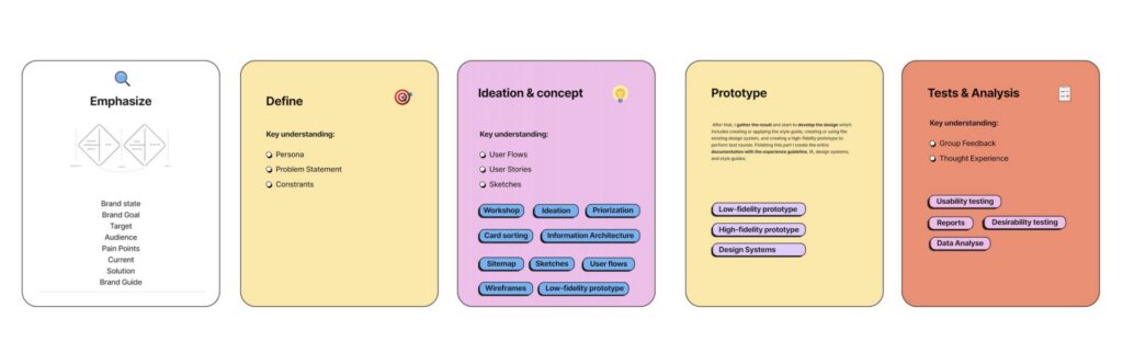
This project was developed as a team collaboration, following a full user-centered design process. Starting with user research and competitive analysis, we identified key pain points such as miscommunication, lack of structure, and difficulty tracking responsibilities. Based on these insights, we designed a solution that simplifies task management, enhances transparency, and strengthens collaboration between users.
The final design combines a friendly and approachable visual identity with a clear and intuitive interface. Features include task assignment, shared calendars, pet profiles, and location-based services for nearby pet-related resources.
My role in the project included contributing to research, ideation, wireframing, and UI design, as well as helping to develop the visual system and final high-fidelity prototype.
Process:
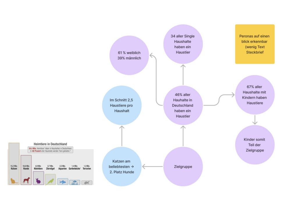
Research:
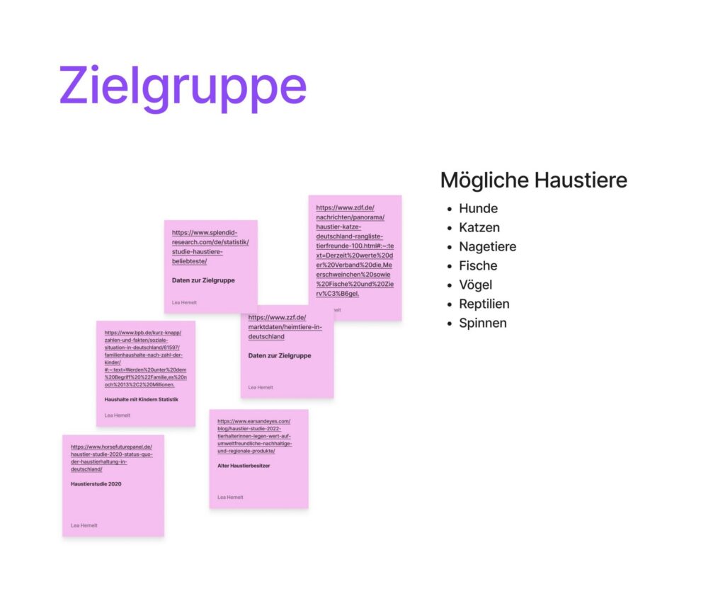
User research revealed challenges in coordinating pet care within shared households, including missed tasks and lack of communication.
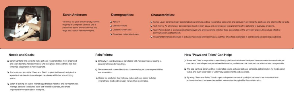
Persona:
A primary user persona representing young pet owners living in shared environments, highlighting needs, goals, and pain points.
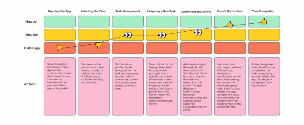
User Journey
The user journey illustrates emotional highs and lows during task management, identifying opportunities to improve usability and reduce frustration.
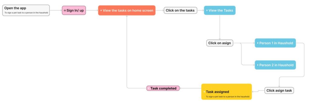
User Flow:
The user flow outlines how users assign and complete tasks within the app, ensuring a clear and intuitive navigation structure
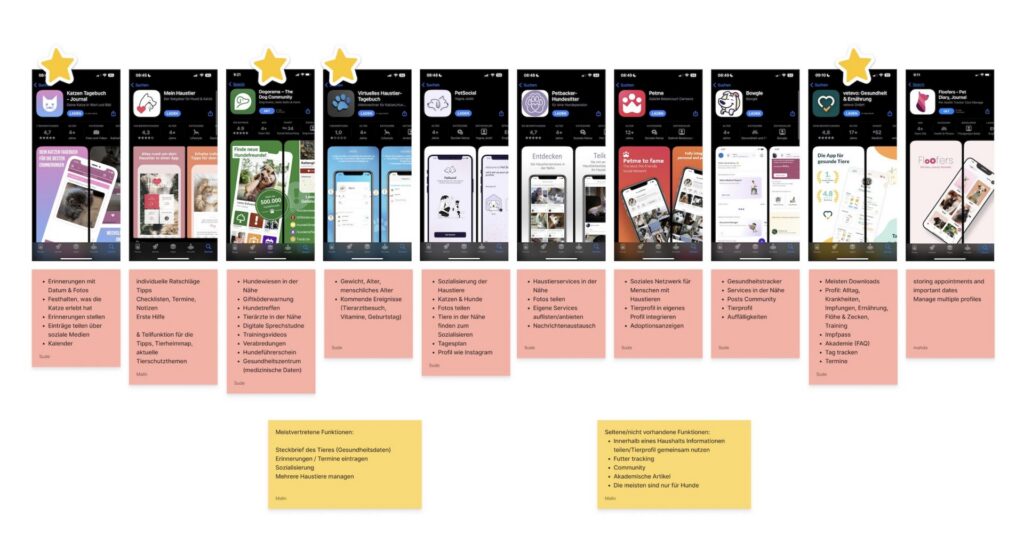
Ideation & Process:
Early ideation focused on defining features, structuring content, and exploring possible solutions through collaborative brainstorming.
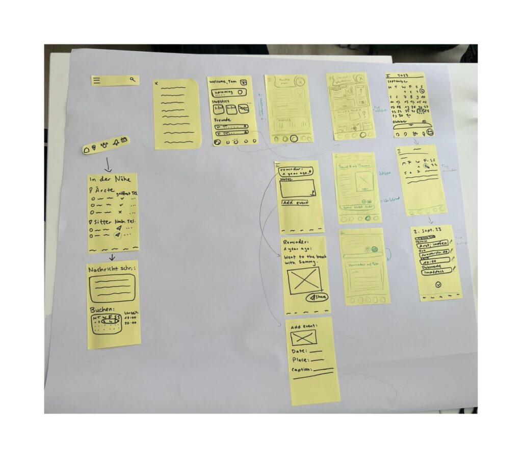
Wireframes (Paper):
Low-fidelity sketches were used to explore layout ideas and quickly iterate on core features and navigation.
Low-Fidelity Wireframes (Digital):
Digital wireframes helped refine structure, hierarchy, and user interactions before moving into visual design.
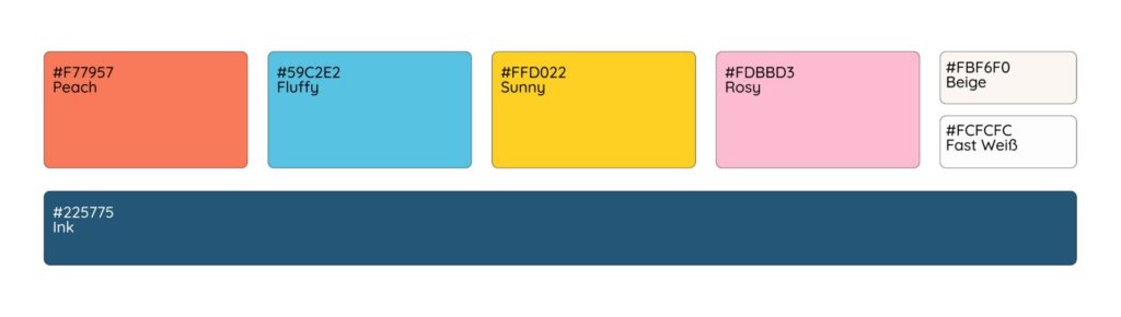
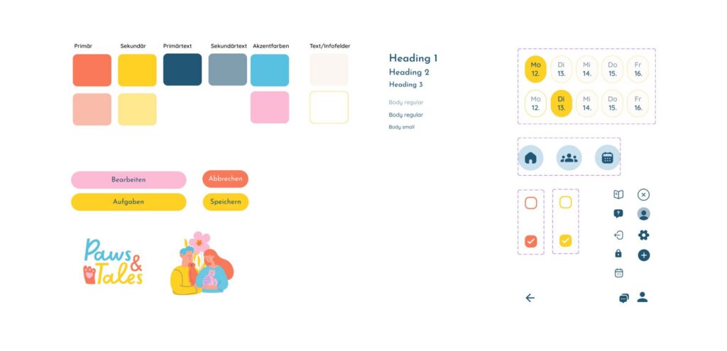
Design System:
A cohesive visual system was developed using soft, friendly colors and clear typography to create an approachable user experience.
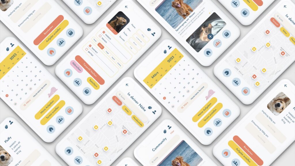
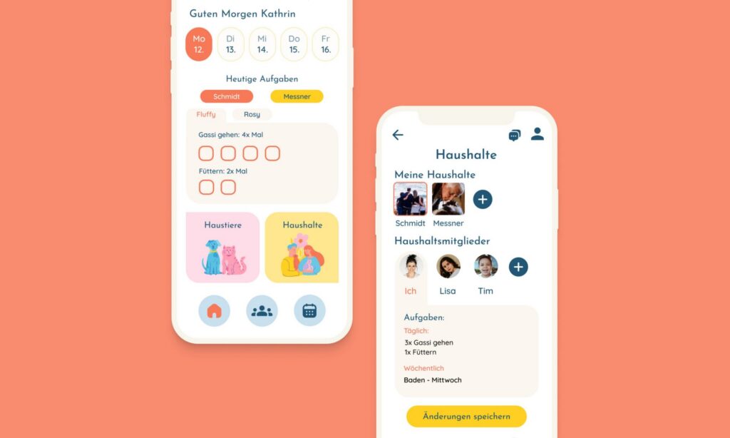
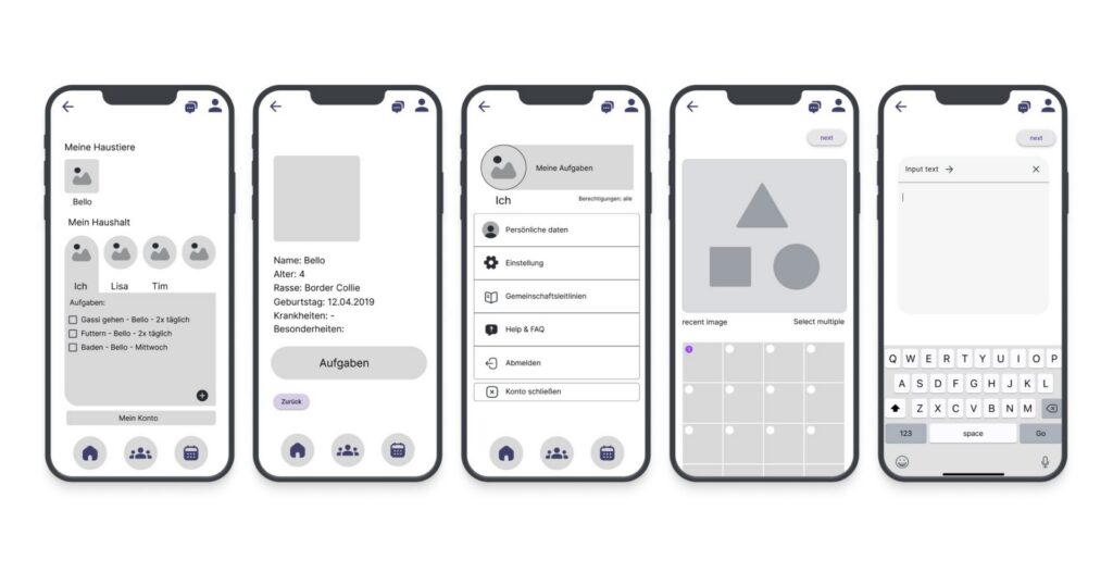
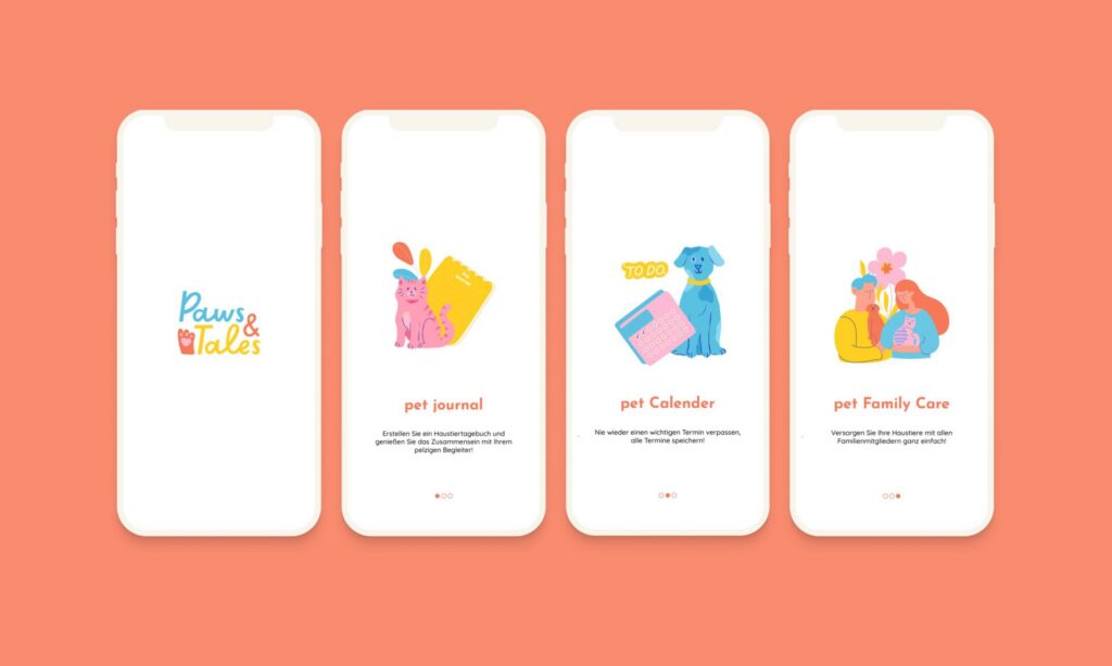
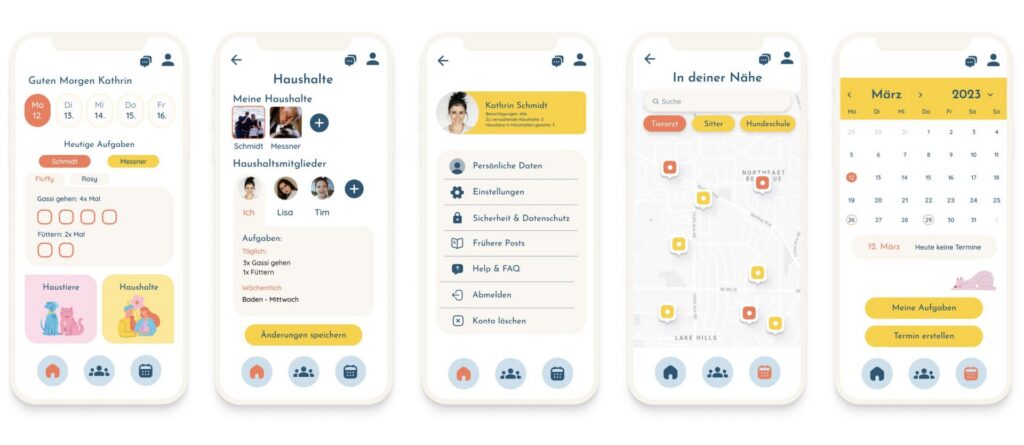
High-Fidelity UI:
Final UI design combining usability and visual identity, focusing on clarity, accessibility, and consistency.
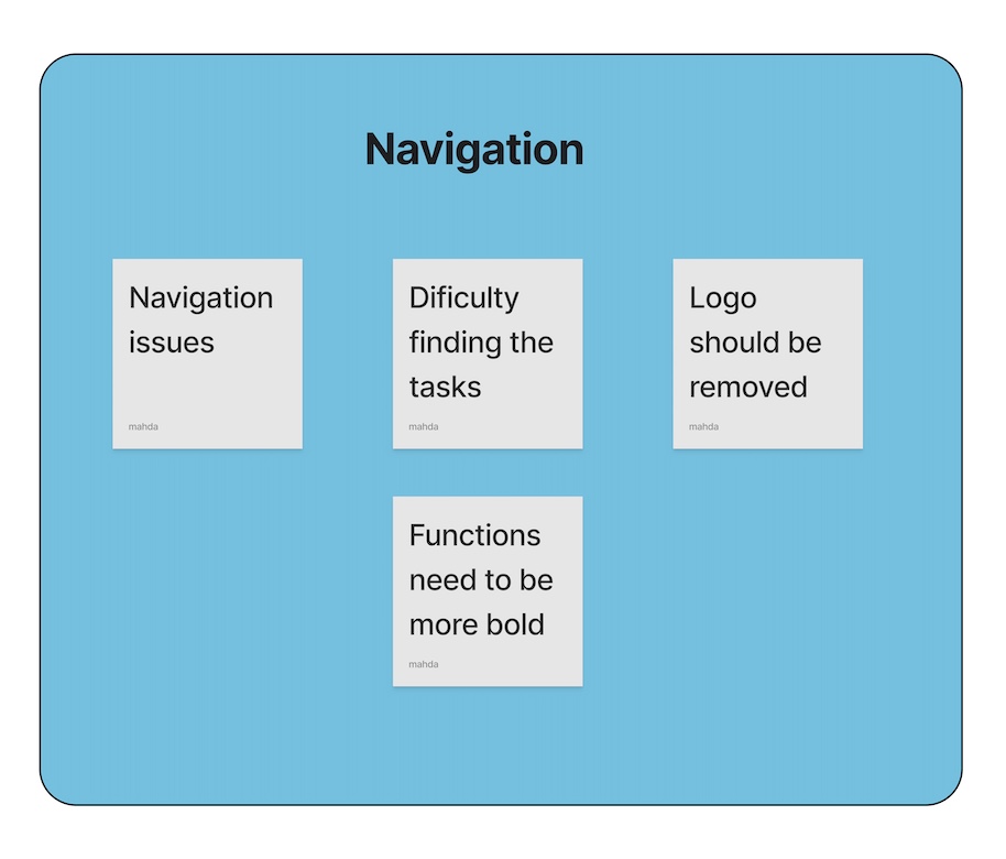
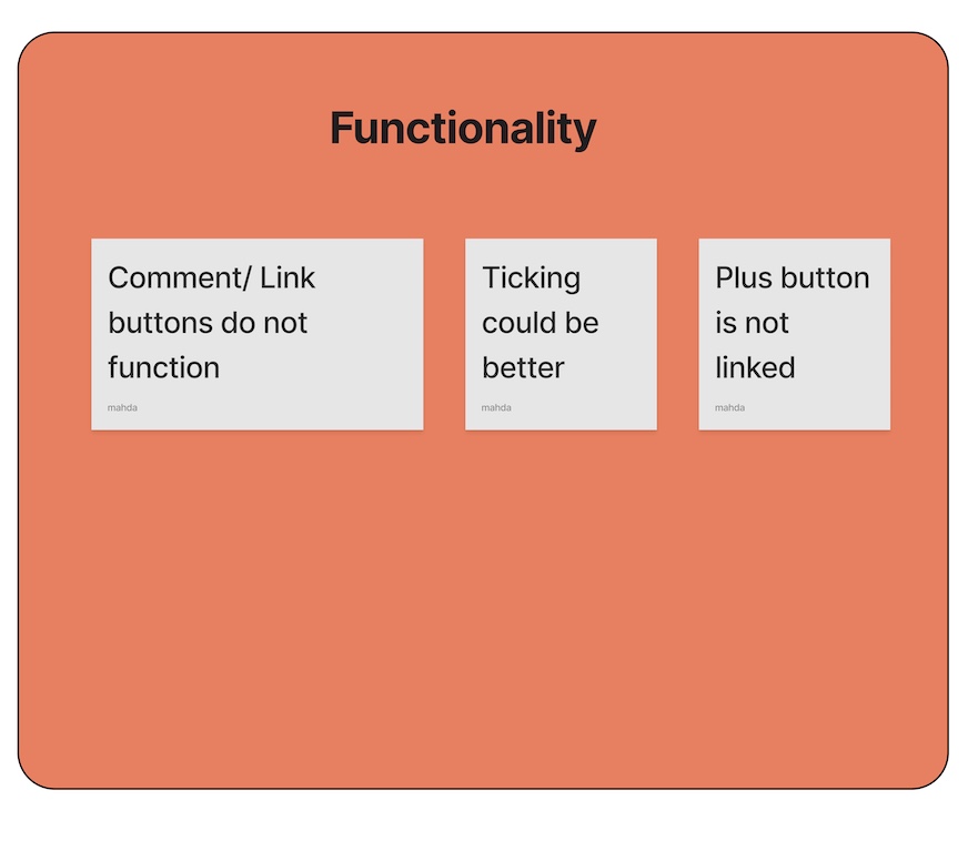
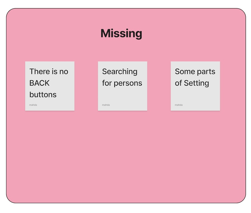
Testing & Insights:
User testing highlighted usability issues such as navigation clarity and feature discoverability, leading to further refinements.
Final Mockups:
Final presentation of the app showcasing the overall look and feel in a realistic context.